
In summer 2006 Norm was commissioned to develop a corporate typeface for Omega.
We were happy to come back to Bienne, the headquarters of Omega is in the immediate vicinity of our former art school. It is a representative building from the early 1960s, the stairwell is glazed and the spacious spiral staircase is lined with curved neon tubes—it looks beautiful at night. In the middle of the curved staircase, a Foucault pendulum hangs through all six floors. We have always been impressed with how carefully and with how much dedication Omega treat their products, every model they have ever manufactured can be repaired in-house, and all spare parts are available.
Omega’s wish was to have an exclusive corporate font that should be derived directly from their logotype, combined with the desire to incorporate this font directly into their existing corporate design. The starting point for the font was the final drawing of the logotype, which an engineer named Eugene Patkewitch had drawn with a hard pencil on millimeter graph paper in June 1975. The construction of Ω looks like a piece of Emma Kunz. Based on this template, the Omega lettering was digitized in the 1990s, apparently some irritating decisions had been made, the line thicknesses and letter heights were not coordinated, the spacing did not correspond to the original template.
First, we dealt intensively with all available Futura versions, early versions that had never been digitized, as well as with digitally available versions. Based on AEGMO, we designed BCDFHIJKLNPQRSTUVWXYZ. Despite the original assumption that the letters from the logotype were inviolable, it quickly became clear that AEGMO would also have to be adapted due to the above-mentioned defects. So it came about that we adapted the logotype to the corporate typeface at the very end, we never designed a Logotype that fast, we just had to type O – M – E – G – A. And last but not least, as a cherry on the cake, we also revised the Ω logo and adapted it to the clean, analog version from 1975.
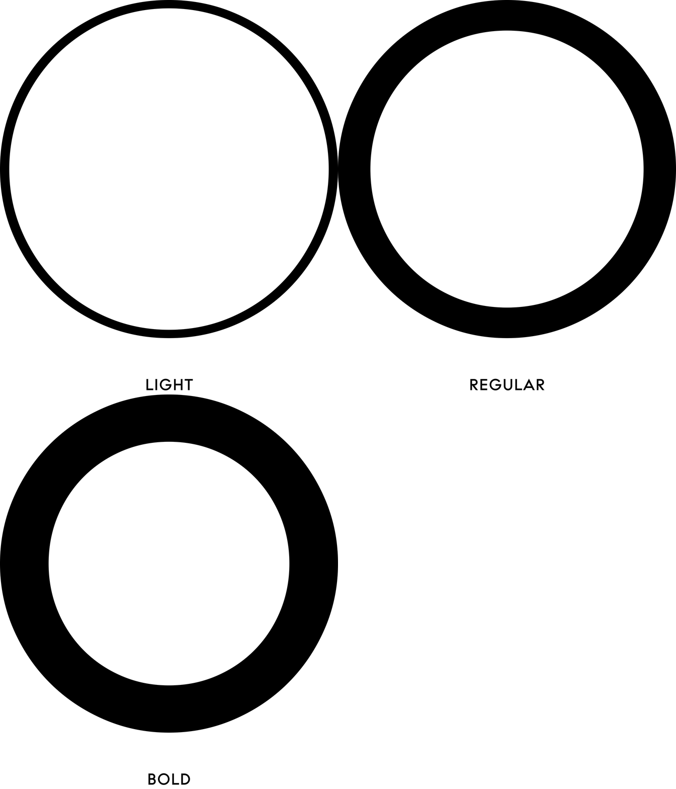
Omega CT was originally developed in two weights, Omega CT Bold (which derived from the Logotype) , Omega CT Regular and Omega CT Italic, later in 2011 on request of Omega we completed with Omega CT Light. Aurèle Sack who had previously worked in our studio, collaborate in the development of all weights.
Excerpt from: Norm in conversation with Anselm Burke, spring 2016
© 2016 Norm, Zurich & Anselm Burke
