

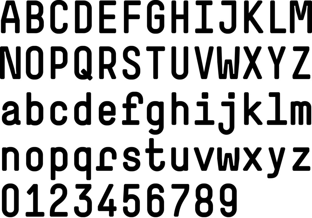


Summer 2001, we began work on a typeface named Simple. We needed a typeface that would correspond to the content and design of our publication The Things. Since the book was to be, among other things, a critique of the Latin script, each and every letter would have to express our reservations towards the conventional shape of those letters. Furthermore, the typeface had to fit the grid of the book, and to be perfectly legible in small sizes as well as large. Simple was also a reaction to Normetica, which we’d finished a year before. Both are monospaced and monolineal, and both are constructed typefaces, but if Normetica is rather wide-ranging in character, Simple is on the condensed side. By then, we had come to consider Normetica as a little too noisy. With Simple, we wanted to design a more discrete typeface, the particularities of which would be a little less obvious. Many of the characteristic shapes, such as f i j l m r t w I M W, led back to the fact that Simple is monospaced. To equalize the spaces, stroke extensions were added, sometimes — as in the case of f i r — in a rather dramatic manner. Three typefaces which we greatly appreciated, and that clearly influenced us during the course of this project, were Cornel Windlin’s Mono, Nico Schweizer’s UltraTeens and François Rappo’s Whiteout. Another factor that may well have influenced the development of Simple was the hot Naples summer of 2001, which is where the main part of the drawing took place. Simple was first published in May 2002. Since June 2002 the Simple‑Family (Simple‑Light, ‑LightOblique, ‑Regular, ‑Oblique, ‑Bold, ‑BoldOblique) has been available on www.lineto.com.
Corporate Typeface
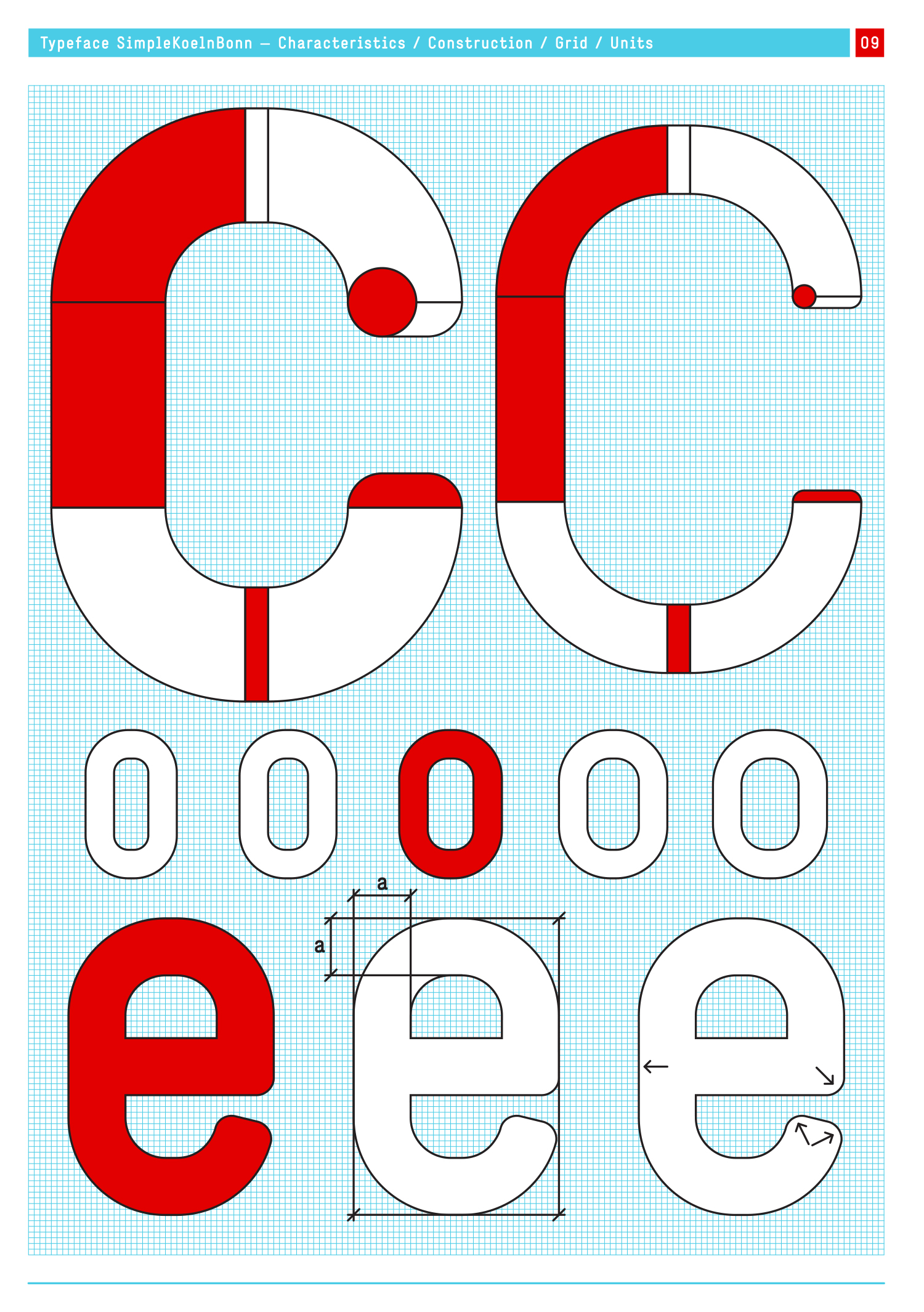
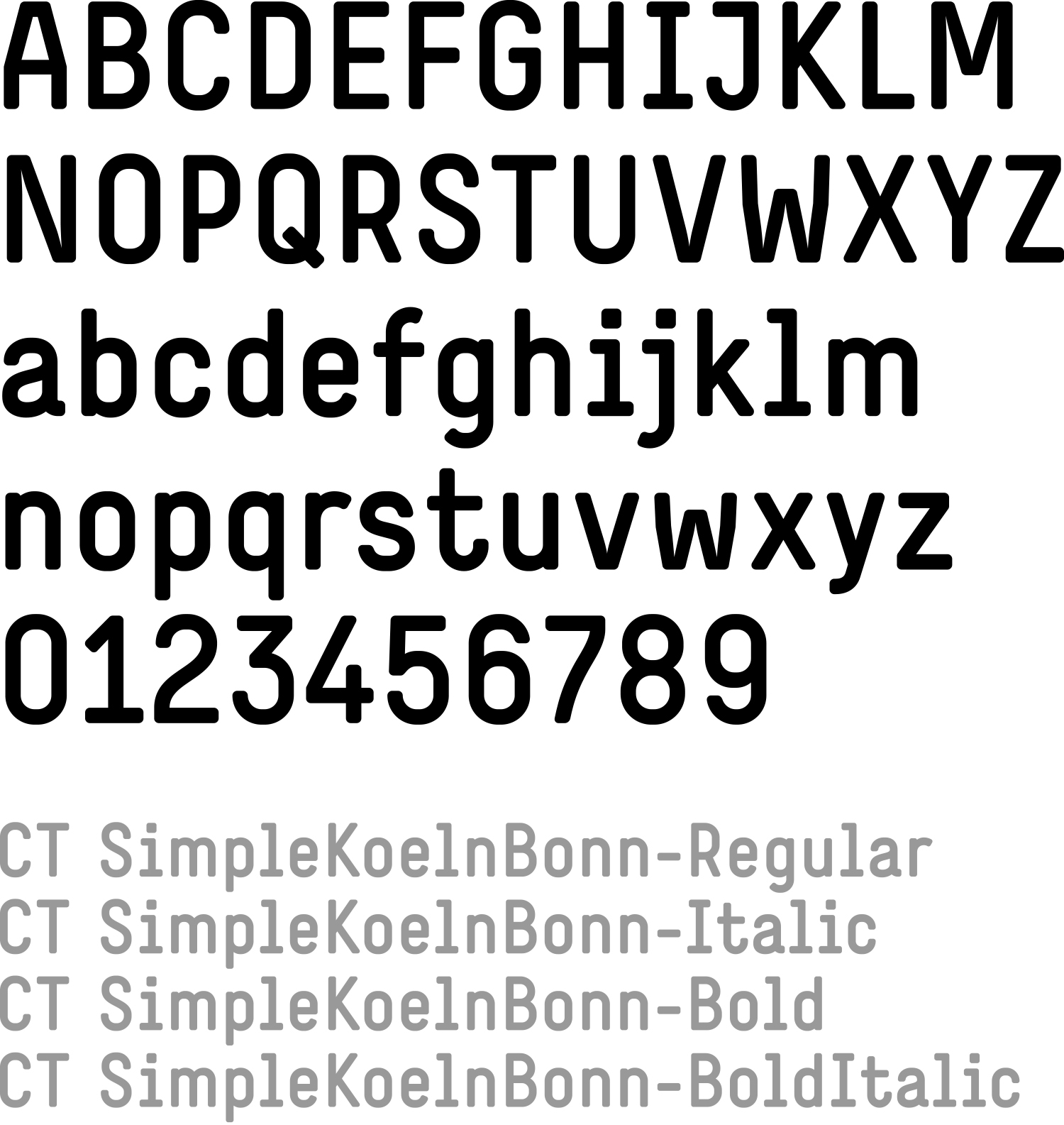
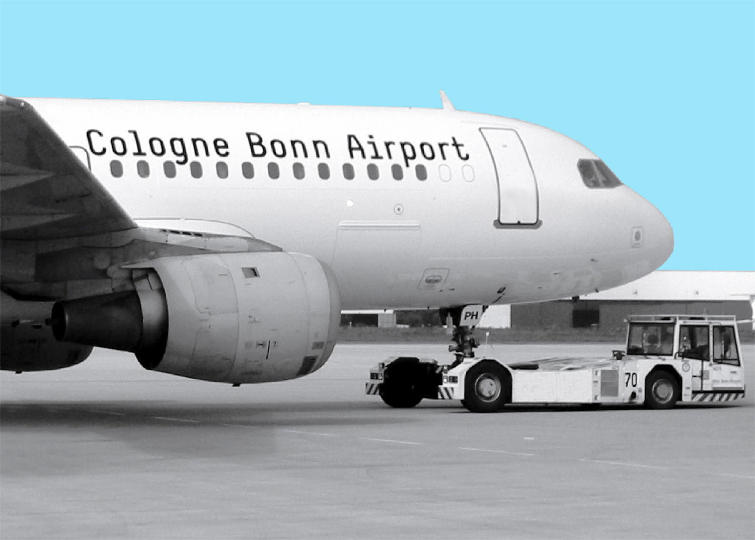
In October 2002, Ruedi Baur of Integral, Paris, asked us whether we could imagine redesigning Simple. Integral had won the design competition for the identity and signage of the Cologne-Bonn Airport, and had used Simple in their competition project. Ruedi Baur suggested a more legible and ‘proportional’ typeface. We liked the idea, but were also somewhat surprised, seeing as, for an airport project, we would have designed a completely different typeface. But the suggestion was interesting and challenging nonetheless; a specific corporate typeface was needed that would help separate official airport information from the overall visual noise of the airport. Our aim, on the one hand, was to preserve the distinctive characteristics of Simple, and, on the other, to have a legible and accessible typeface. All the letters (with the exception of o) were reshaped, and their proportions adjusted. The final setup, mastering and hinting was done in collaboration with Lineto. SimpleKoelnBonn was finished in April 2003, containing the following weights: SimpleKoelnBonn‑Regular, ‑Italic, ‑Bold, ‑BoldItalic, ‑TableFigures and ‑Experts. SimpleKoelnBonn was designed exclusively for the airport.
Zurich, April 2004, Dimitri Bruni & Manuel Krebs
Recently there have been attempts to revisit LL Simple with the kind help of Giliane Cachin.
The aim is to redraw it as a proportional, fully functional text font (sooner or later).
Excerpt from: Simple Type Specimen
© 2004 NORM, Zurich