


At the time when the Swatch project started, our clientele practically consisted of the galleries in Zurich’s Löwenbräu, which was quite monothematic. We were very happy to work outside of art and culture, especially since this is exactly the niche foreseen for offices like ours.
2010
In contrast to Omega, Swatch was a comprehensive CI Programme.
Swatch had grown steadily since the 1980s. Before 2010, Swatch had no uniform guidelines. The CI had never really been defined, it was rather a patchwork to which something was constantly being added and supplemented. This resulted in a large number of logo versions, some of which, especially the countless sub-brands were, very spectacular. It was more like a house to which something is constantly being added, until at some point there is a colossus of which nobody knows why it looks like that.
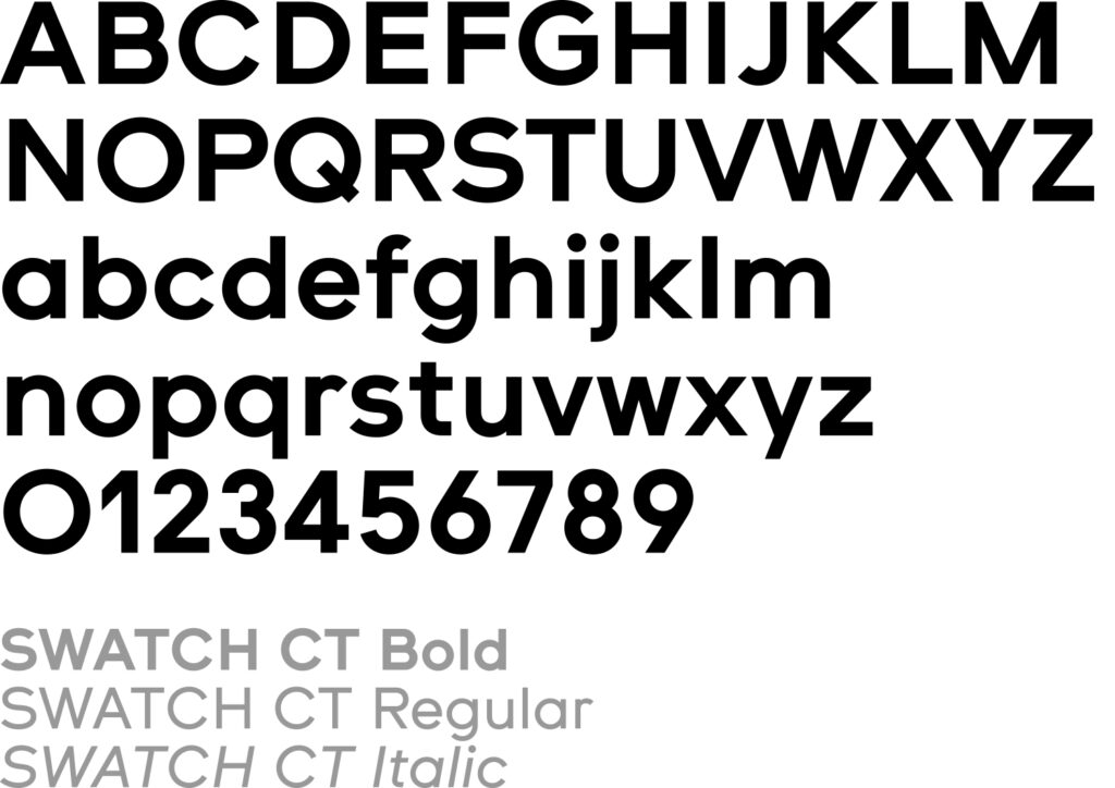
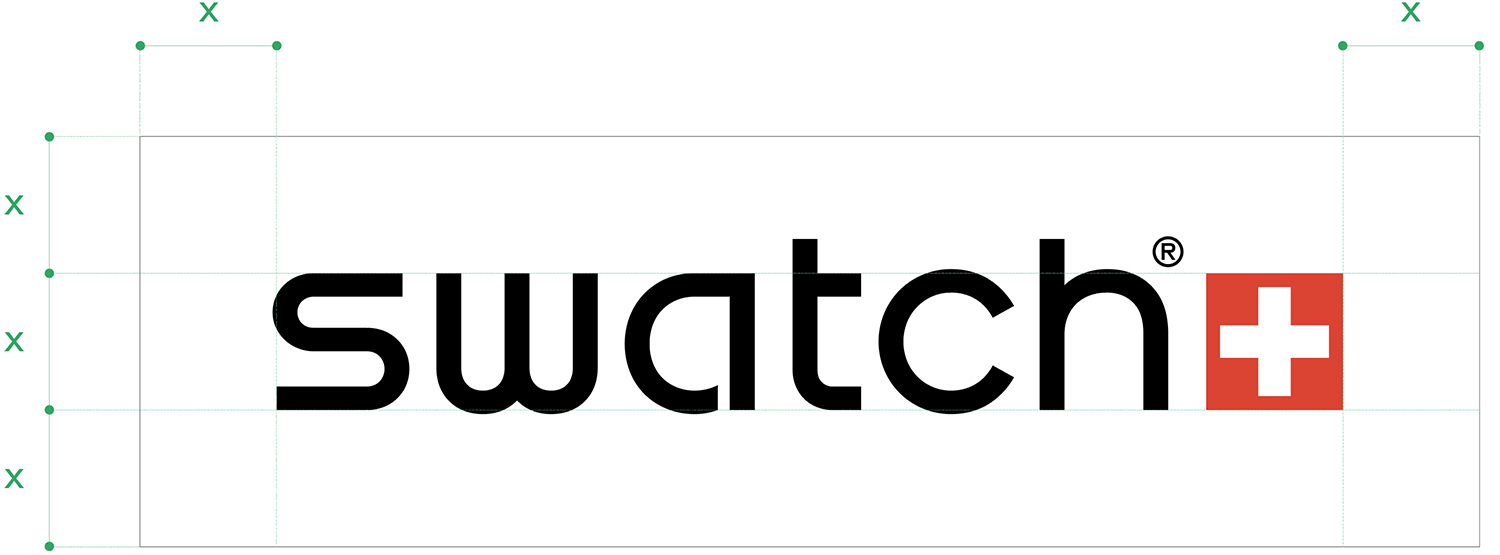
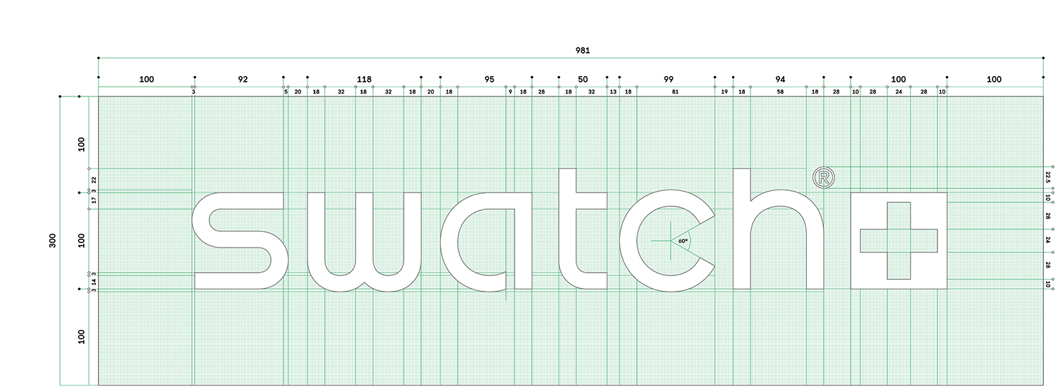
Swatch’s request was formulated very openly, everything was possible, including the possibility of completely renewing the entire CI. It quickly became clear to us that it would be wrong to fully redefine the existing logotype. There were not only economic reasons for this (the costs of re-registering the brand worldwide), but rather the fact that the existing lettering was established and that it would be wrong to give up this trump card. This means that we have only modified the existing lettering to the extent that the trademark did not need new registering. But, and this was the core of our proposal, we would develop a corporate typeface that would hold the brand together. As with Omega, we originally started with the letters of the logotype for the corporate font, but ultimately we could only use the ‘c’, all the other letters were far too strange. reflecting (especially the ‘s’ and ‘w’ with its bizarre construction). It was clear that a text font could not really be developed from the logotype. With its typical geometric design, it reflects too strongly the early 80s. We then developed a friendly looking, robust text font, for the needs of a global use, from micro to macro applications.
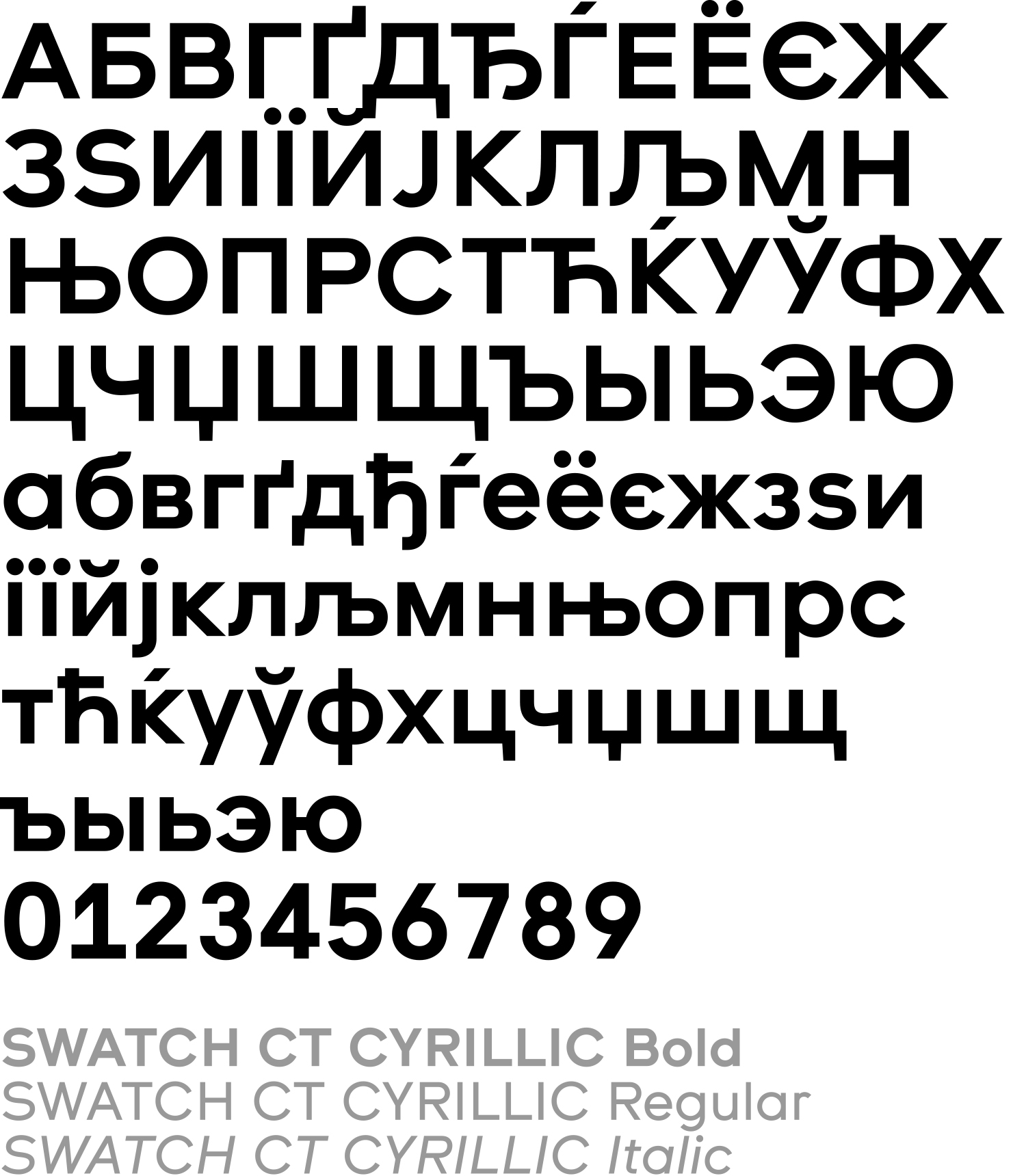
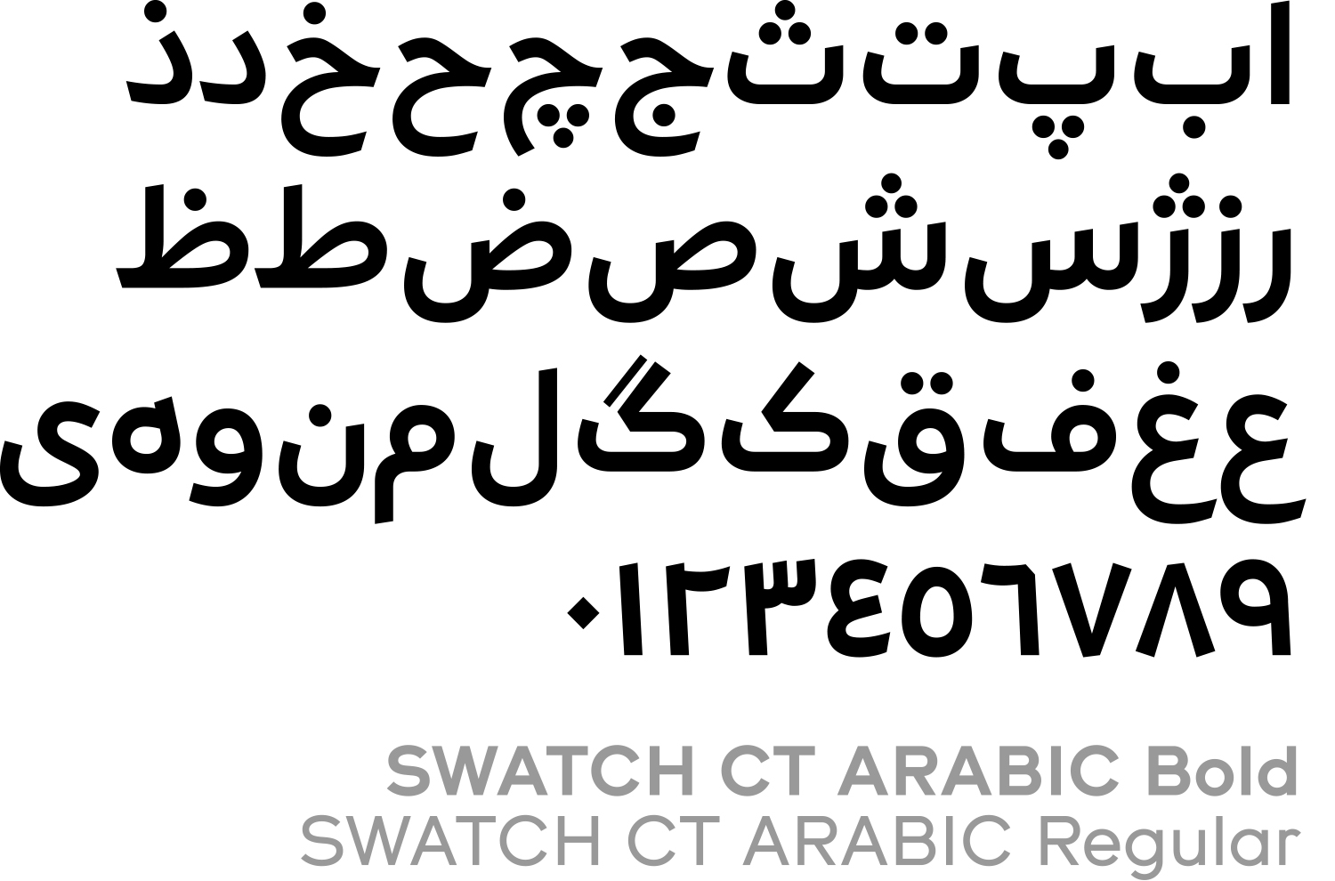
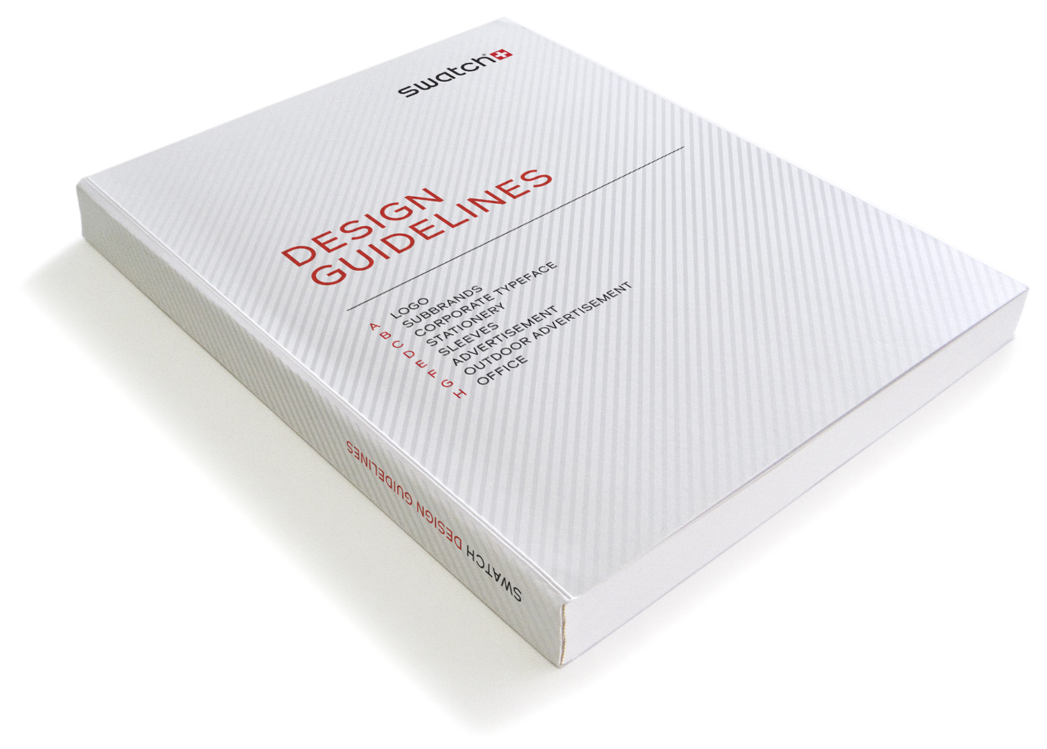
Our work was very satisfying, there was tabula rasa with the iron broom and we were able to define everything from scratch from stationary, to advertisement, to packaging etc. The collaboration with Swatch was extremely efficient, most of it going through a single contact person who presented and represented all designs internally. The range of applications was wide, so it could be that we discussed CI-compliant parasols for surf events in the morning and then defined massive billboards for the South Asian market in the afternoon. Swatch became very time-consuming, at least one of us was constantly busy with it for a good two years. The ©2012 Swatch Design Manual resulted from this first phase of work. Although it would have been entirely possible to only publish this online, Swatch insisted on a printed version: We need a book to emphasize the importance of our guidelines! In 2013 the corporate font was expanded to include Cyrillic and Arabic. In addition, the advertisement templates were adapted and expanded, this resulted in the ©2015 Design Manual.
Swatch CT Regular, Italic and Bold were developed in collaboration with Aurèle Sack; Swatch CT Arabic Regular and Bold were developed in collaboration with Pascal Zoghbi; Swatch Cyrillic Regular, Italic and Bold were developed with Viktoriya Grabowska’s assistance.
Excerpt from: Norm in conversation with Anselm Burke, spring 2016
© 2016 Norm, Zurich & Anselm Burke