


Bruce Lee, Cover and Promotional Poster 2005, first use of Replica
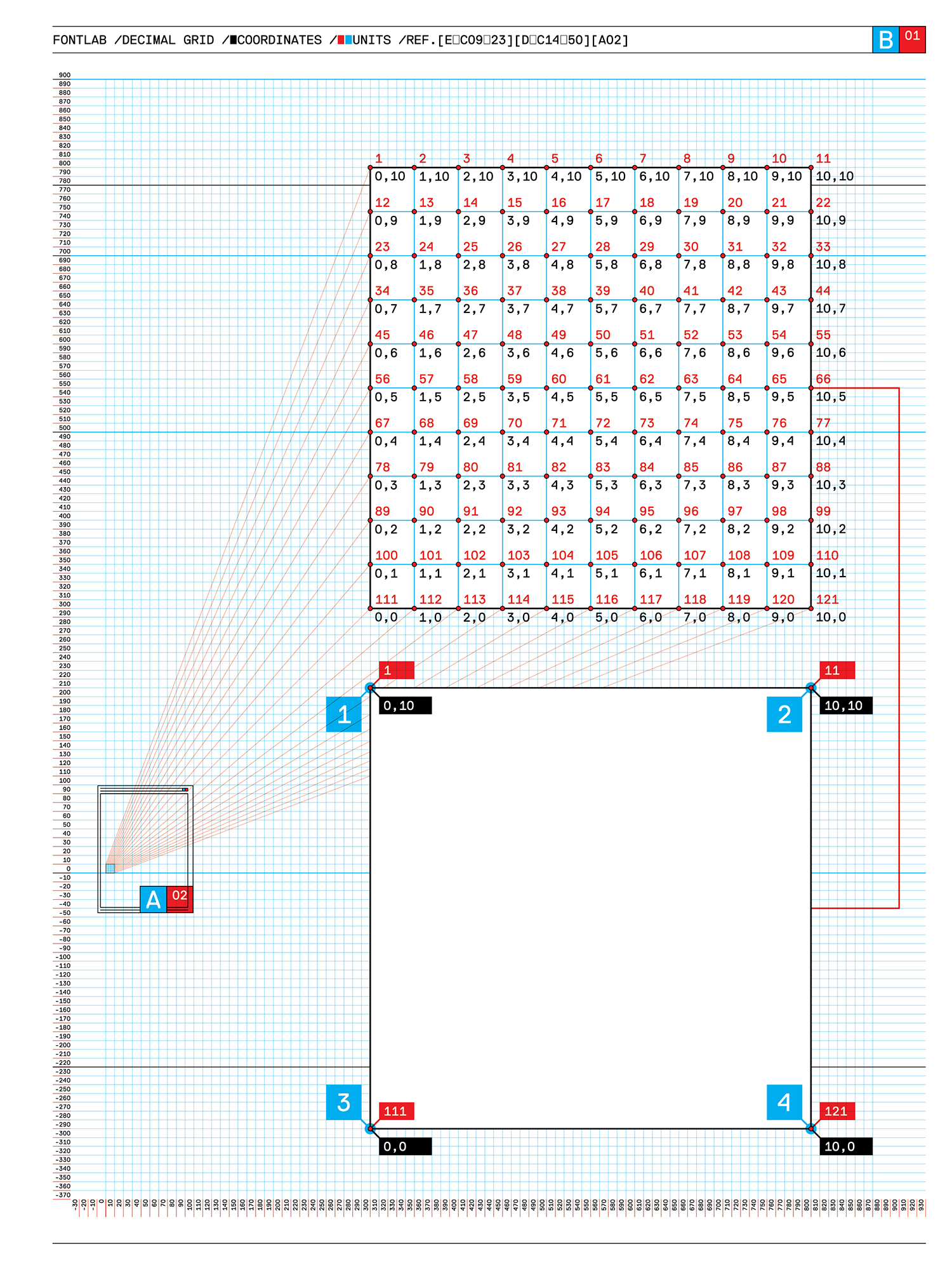
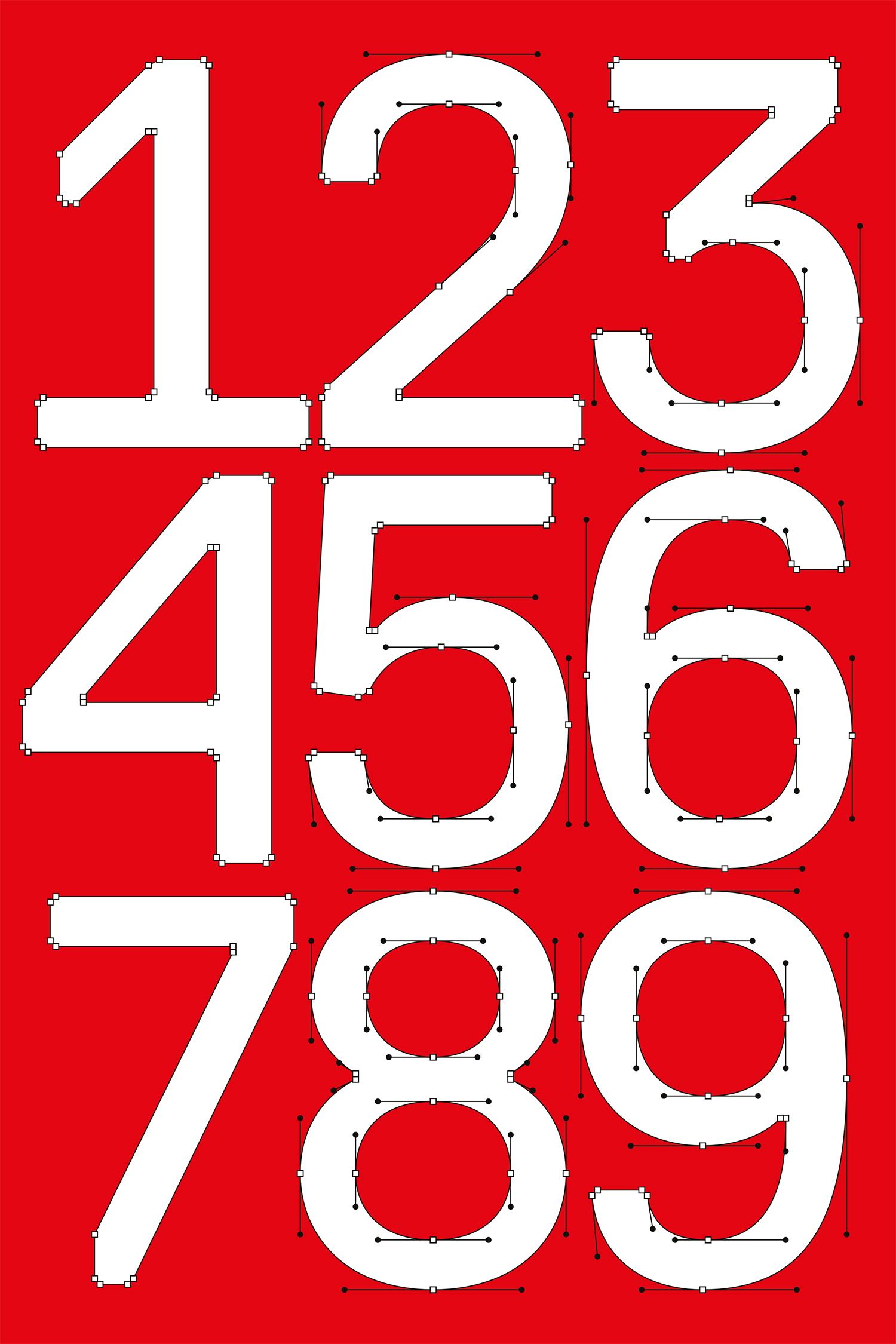
D – I see the problem as not so much the details of the drawing but as the lack of a concept. That was the big difference from Replica. In the latter case, there was an idea, a method, from the outset. After our failure with Standard, we had dropped the project of a more neutral typeface for a while, and when we took it up again in 2004–5, we soon noticed that we had to start with formal, almost mathematical decisions, which would then affect the drawing and the form. We did not know exactly what the effects would look like, but we began by defining formal principles. The most important of these definitions was to enlarge the grid that the FontLab software provides for designing fonts. We multiplied this grid ten times, so that we were working not with a 700 grid, as the software intends, but just a 70 grid. Consequently we had many fewer possibilities to place nodes and Bézier control points, which extremely limited the freedom of drawing. On a plane that would normally have a 121 dots (11 exposure 2) available, we only had 4 from which to choose.
M – That was a somewhat anachronistic decision, since the trend today is in the opposite direction. You mentioned once that some typography blog called for the grid in FontLab to be made much smaller, Somebody called for a 7,000 grid in order to be able to draw more accurately. But it seems to me that, in addition to your deliberately anachronistic attitude, there was also a pragmatic reason for your decision: you wanted to be able to see in the program’s preview mode what the drawing would look like, and because the preview used a larger grid than was available when drawing, you took this one as the standard.
D – Right. That was, admittedly, an important reason. It provoked me that the preview mode of the software can only render a tenth of the actual grid, and I said to myself: “What you see is what you get.” So I only drew the letters as sharply as I could see them. But the discussion you mention in the typography blog also provoked us. We said to ourselves, if you demand a grid which would have ten times as many dots as are currently available, now we’ll show you that we can even work with ten times less. Naturally the possibilities are very limited, if you arrange all nodes and Bézier control points on such a coarse grid. But by doing so we found what we had been looking for: a predefined concept that had an inevitable effect on the drawing.
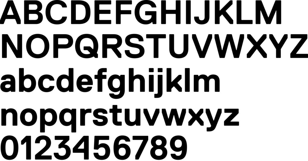
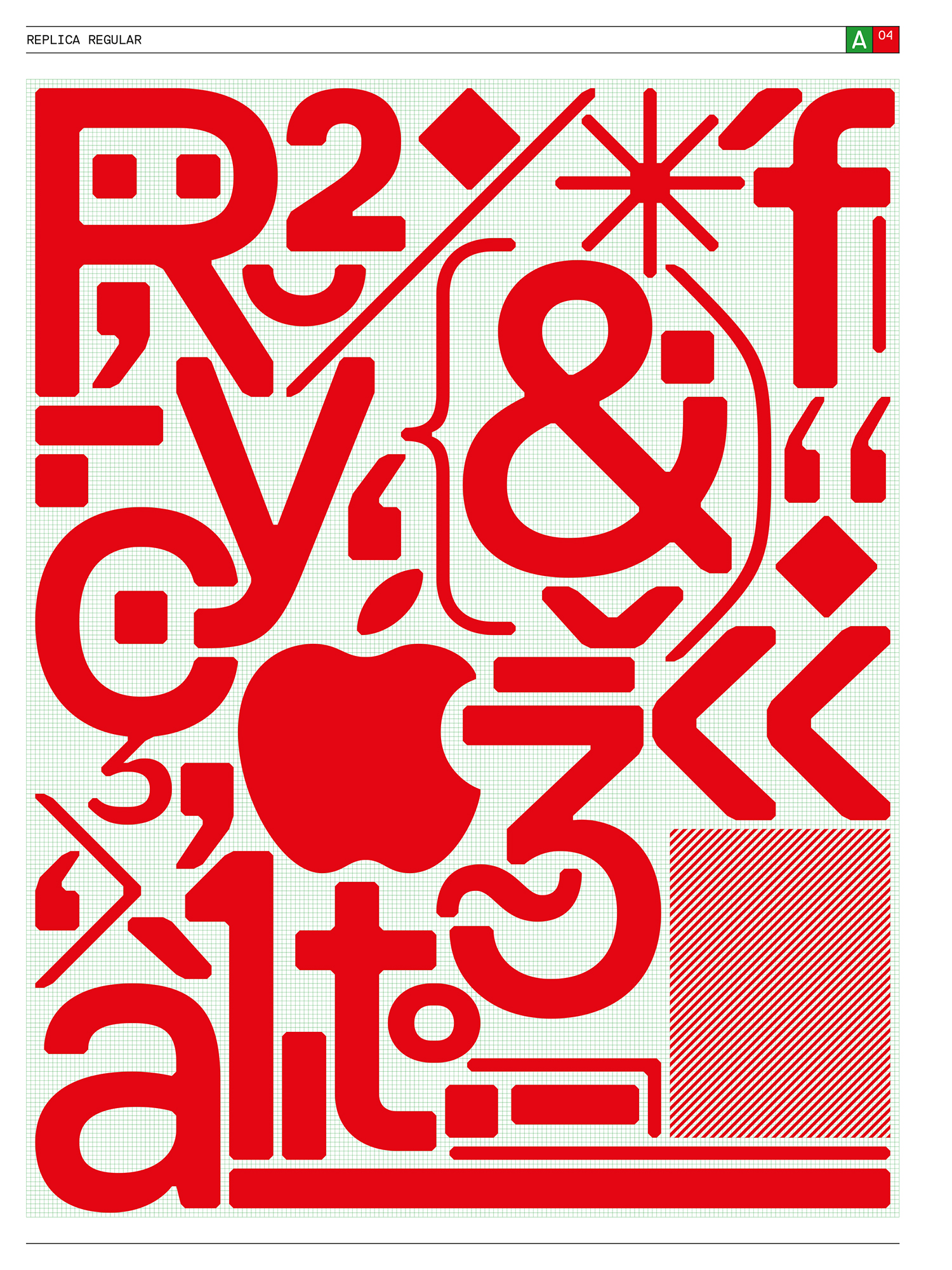
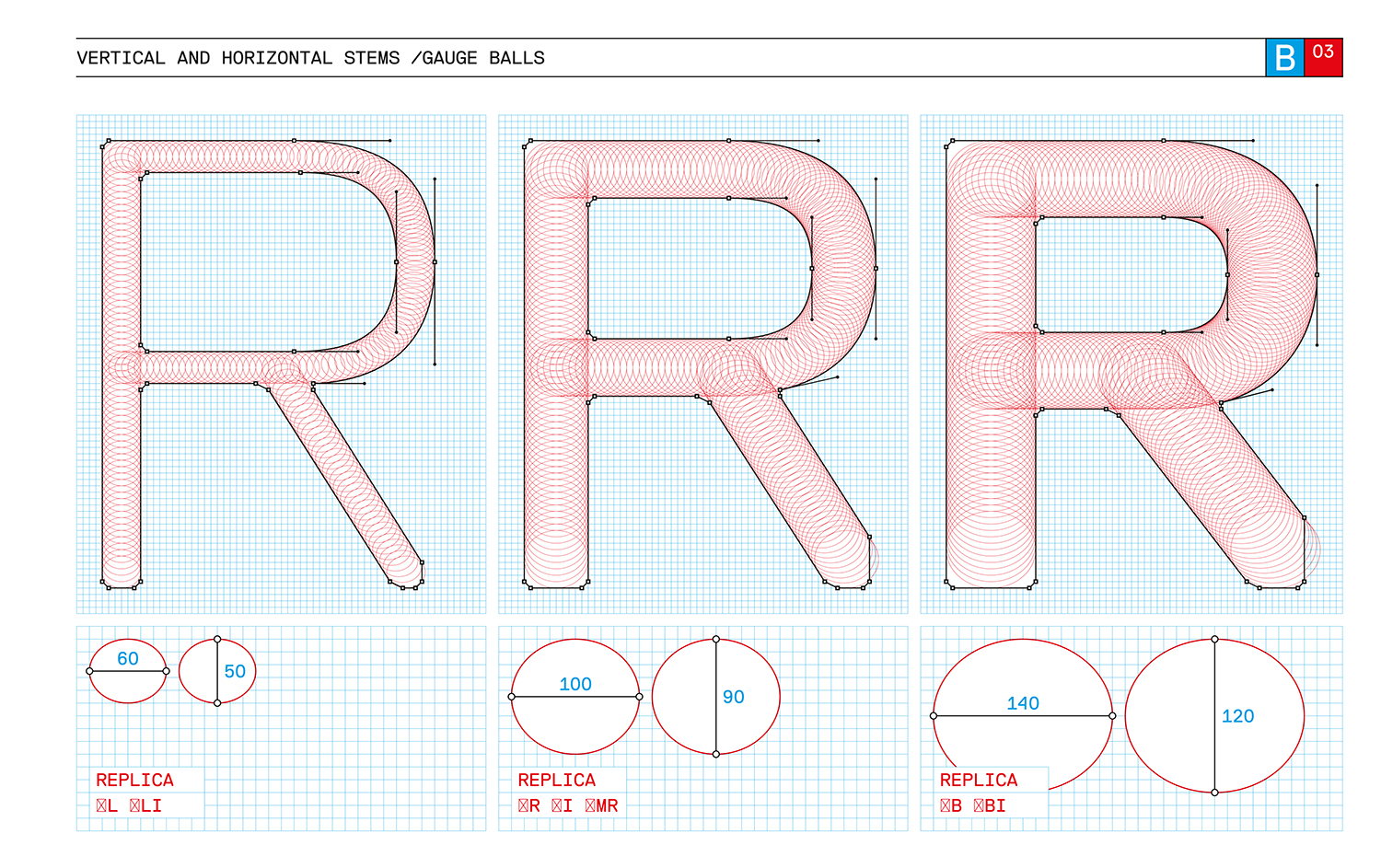
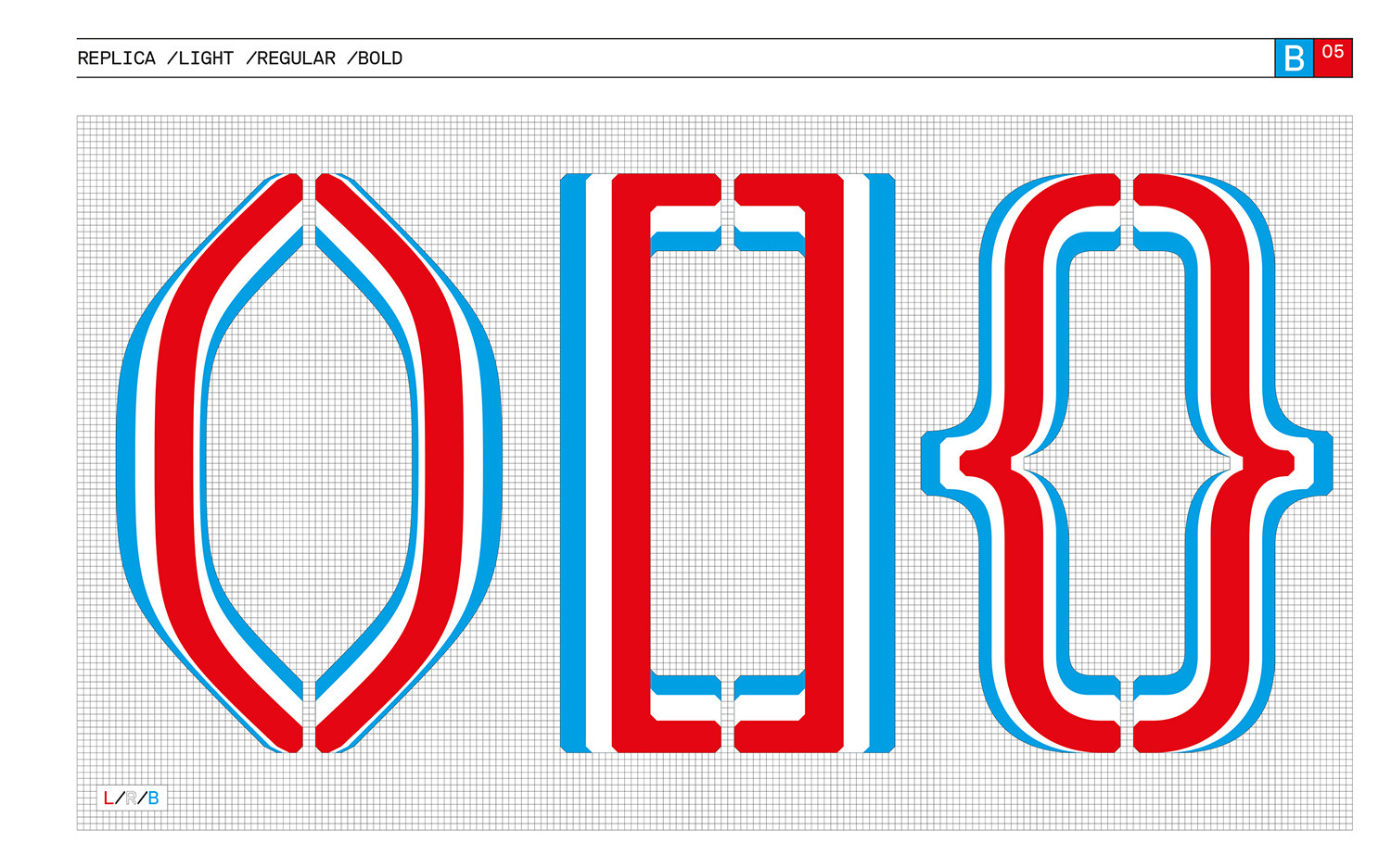
M – A second, formal definition we made early on for Replica concerned the so-called bevel. All of the characters are cut off in the corners, so that there are no right angles at all. This results in a kind of rounding effect, and when the type is small, it looks slightly damaged, as if it hadn’t been drawn clearly. We had rounded off the corners before, for Normetica and Simple. But in my view the difference is that it wasn’t necessary then, whereas with Replica it was about making the grid visible.
D – Yes, I see it that way as well. The bevels of Replica serve to make the grid visible, since the cutoff corners are exactly the same width as a unit in our new, larger grid. This function of making the grid visible is especially important for letters where the grid would not otherwise be seen, like the uppercase I, for example. Nevertheless, it is striking that we have had rounded corners on all our typefaces so far, and the reason is perhaps that it is a way to make a typeface more specific.
M – It makes the typeface more identifiable. But in a sense it is also a tricky decision, perhaps not so much with the outer bevels but with the inner ones. If you compare it with Unica, say, then you see that there the inner corners have so-called ink traps: incisions inward. Because the exposure in photocomposition, for which Unica was designed, often makes the corners blurry, there is a risk that too much ink will collect in the corners when printing, and ink traps are supposed to prevent this. For Replica, we not only dispensed with these ink traps but also filled out the inner corners even more by giving them bevels.
D – Seen in that way, the inner bevels are perhaps a reaction to today’s technical tools. In the case of Unica, the blurriness that results in photocomposition required that the letters be modified so that they would have their proper form when printed. Today such precautions are no longer necessary, since digital rendering on a computer screen corresponds almost 100% with the printed result. Another argument, of course, is that we deliberately made Replica a little dirty. We consciously placed too much color in the inner corners to make the triumph of technology visible.
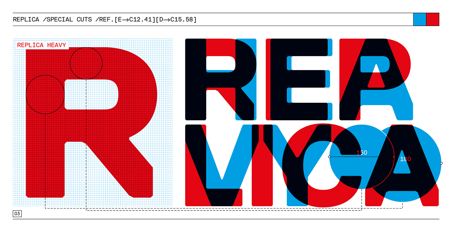
M – The third formal decision from which we set out with Replica was cut diagonals. All of the diagonals are cut vertically in the corners so that there are no pointed ends—on the A, K, or R, for example. We did that to save space so that the letters could be set very closely. Like the bevel, that is a very striking intervention, and it is one of the main identifying features of this typeface.
D – Yes, the cut diagonals are extremely evident. That was one of the reasons for the crisis we had last year when working on Replica. We asked ourselves what the effect of the striking bevels and the cut diagonals would be over the long term. Would we have enough of it at some point? I am sure that the diagonal cuts, because they are so extremely evident, will be crucial to how Replica is perceived.
M – I have no ambitions for Replica to be the typeface of the next twenty years. It is of the present, and it is important that it has that character. In general, I find our former ambition to want to design a neutral, timeless typeface was misguided. I believe that it is not possible to develop a neutral typeface at all. If a typeface like, say, Helvetica seems neutral to us today, it is because its qualities no longer strike us, no longer surprise us. A typeface can thus lose its qualities over time, but it is impossible to design it without qualities.
D – In that sense, the special thing about Replica is that it has two faces. From a distance—that is, when used in small sizes—you hardly see the bevels and cut diagonals at all. You perceive them unconsciously, perhaps, but it looks very fluid and normal. As soon as the type is large, however, its unmistakable qualities stand out strongly. I see it as a big positive that Replica has these two sides.
Excerpt from: Replica Type Specimen
© 2008 NORM, Zurich & Lineto GmbH